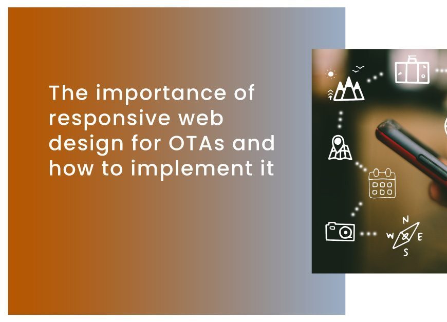
Your website is your most important asset as an online travel agency (OTA). It’s where customers come to browse, compare prices, and ultimately book their travel plans. But with so many different devices and screen sizes on the market today, creating a website that looks great on all of them can be challenging. That’s where responsive web design comes in.
In this blog post, we’ll discuss the importance of responsive web design for OTAs and how to implement it effectively. We’ll also provide real-life examples and data to demonstrate the benefits of responsive design for your business.
What is Responsive Web Design?
Responsive web design (RWD) is a design approach that enables web pages to render well on different devices and screen sizes. With RWD, a website’s layout, content, and images are adjusted automatically based on the screen size of the device being used to view it.
For example, if a customer visits your OTA’s website on a desktop computer, the site will display a full-size layout with multiple columns and large images. However, if that same customer visits your website on a mobile device, the site will adjust to a one-column layout with smaller images optimized for mobile screens.
Why is Responsive Web Design Important for OTAs?
There are several reasons why responsive web design is crucial for OTAs. First and foremost, it improves the user experience. If customers have difficulty navigating your website on their mobile device, they will likely get frustrated and go to a competitor’s site instead.
According to a Google survey, 61 % of users said a bad mobile experience made them less likely to engage with a company. Additionally, a staggering 41% of users said they would likely visit a competitor site in such a scenario.
Another reason why responsive design is essential for OTAs is that it improves search engine rankings. Google has stated that it prefers responsive websites because they provide a better user experience. Therefore, responsive sites tend to rank higher in search engine results pages (SERPs) than non-responsive sites.
Additionally, responsive design can save OTAs time and money by eliminating the need for a separate mobile site. Instead of maintaining two locations, one for desktop and one for mobile, responsive design allows OTAs to have one site that works well on all devices.
Real-Life Examples of Responsive Web Design in Action
To understand the benefits of responsive design, let’s take a look at a few examples of OTAs that have implemented this approach effectively.
Expedia
Expedia is one of the world’s largest online travel agencies, and its website is an excellent example of responsive design in action. When viewed on a desktop, the site has a full-size layout with multiple columns and large images. However, when viewed on a mobile device, the site adjusts to a one-column layout with smaller images optimized for mobile screens.
Booking.com
Booking.com is another OTA that has implemented responsive design effectively. The site adjusts its layout and content based on the screen size of the device used to view it. Additionally, the site’s search function is prominently displayed at the top of the page, making it easy for users to find what they want.
How to Implement Responsive Web Design for Your OTA

Now that we’ve discussed the benefits of responsive design and provided examples of OTAs that have implemented it effectively, let’s take a look at how to implement it for your own OTA.
1. Use a Responsive Web Design Framework
There are several frameworks available that can help you implement responsive design effectively. Popular options include Bootstrap, Foundation, and Materialize. These frameworks provide pre-built templates and components that can be customized to fit your OTA’s specific needs.
2. Optimize Images and Media
Images and media can significantly impact the loading time of a website, especially on mobile devices. To ensure that your site loads quickly and efficiently, it’s important to optimize images and media for different screen sizes. It can be done using tools like Adobe Photoshop or online services like TinyPNG.
3. Prioritize Content
When designing smaller screens, it’s essential to prioritize content and ensure it’s easy to read and navigate. Consider using larger font sizes and minimizing the text on each page. Additionally, use clear calls-to-action to guide users towards desired actions, such as booking a hotel room or flight.
4. Test on Different Devices and Screen Sizes
To ensure your site looks and functions appropriately on different devices and screen sizes, it must be tested thoroughly. It can be done using tools like BrowserStack or physically testing various devices. Make sure to try it on both iOS and Android devices and different screen sizes and orientations.
Recommended: How To Optimize An OTA Website For Search Engines And Improve Online Visibility
In today’s mobile-first world, responsive web design is essential for online travel agencies. By providing a better user experience, improving search engine rankings, and saving time and money, responsive design can help OTAs stay ahead of the competition. Using a responsive web design framework, optimizing images and media, prioritizing content, and thoroughly testing, OTAs can implement responsive design effectively and provide a great user experience on all devices.
About Vervotech:
Vervotech is a leading Hotel Mapping and Room Mapping API that leverages the power of AI and ML to quickly and accurately identify each property listing through the verification of multiple parameters. With One of the industry’s best coverage of 98% and an accuracy of 99.999%, Vervotech is quickly becoming the mapping software of choice for all leading global companies operating in the travel and hospitality industry. To learn more about Vervotech and the ways it can enhance your business in the long run contact us: sales@vervotech.com


